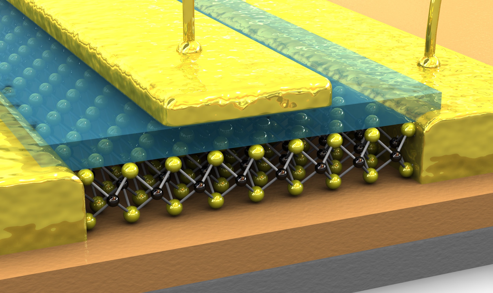
A beautifully looking graphics, isn’t it? But there is a major caveat. As its creators would agree, this image is only a very crude depiction of reality and shouldn’t be used for any scientific purpose… (c) LANES, EPFL
Nanotechnology is a wonderful science that has pushed functional devices to sizes not far away from the size of atoms. So small that if you want to image such structures, even a conventional electron microscope wouldn’t get you far. There is no way to directly see what is going on. This is a common problem. Take condensed matter physics – it is impossible to directly visualize the various interactions and events taking place inside a crystal. Or photonics, where complex light fields interact with tiny nanostructures in ways that can be really difficult to visualize, especially in real-time.
So, no wonder that artificial graphics often serve to illustrate a scientific concept or a certain device. And with the prevalence of advanced computer graphics programs such illustrations are becoming more and more fancy. In my opinion, this is a dangerous trend, because such graphics can distort the underlying science they try to depict.

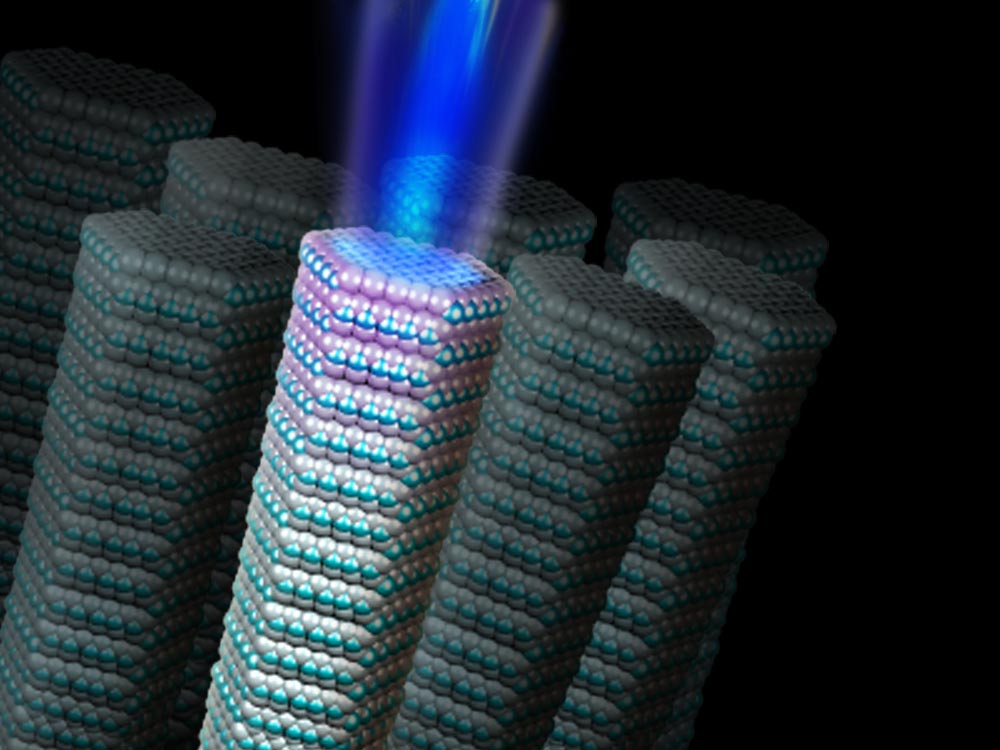
Atom balls emit beams of light. It might have been better to keep it simple and not go down to the atomic scale. (c) National Science Foundation
Before starting to outline just how wrong such fancy images can be, I like to emphasize that I don’t want to criticize individuals over this, this is just to highlight a general trend that most of us are guilty of following. I mean, I am guilty, too, and have published papers as an editor containing overly fancy graphics. And the image shown above, by the way, made it on the cover of one of the Nature family of journals, although of course other journals show plenty of such graphics, too.
But why are such nice graphics wrong? Here are some reasons:
- Like above, they often show a mix of atoms and dense material. The atoms of the gold contacts are not shown, yet they are of similar size as those depicted. Why is this wrong? Well, such an image suggests that the gold contacts are governed by bulk material properties, whereas atomic effects are only relevant for part of the structure. Yet, on such length scales all atoms of the device influence each other and can’t be isolated in this way. The same for the sticks that are supposed to be atomic bonds in such images. They stop at the interface, which isn’t scientific reality either – atoms across such interfaces influence each other.
- Both the atoms as well as the contacts reflect light. At these length scales there can’t be such reflections because these sizes are smaller than the length scale of light. Why is this wrong? Especially for illustrations of photonic devices this is a problem because it creates a wrong thinking about light on the nanoscale. Basically, you would have to consider local electromagnetic fields. On this scale the interaction of light fields with metals for example is much more sophisticated than simple reflection. And come on, such detailed, mirror-like reflections from atoms?
- On the nanoscale, laser beams are often shown as diffuse beams of light. I am always puzzled why devices that are on the scale of the wavelength of light are shown to ’emit’ such beams in a way that a floodlights would do. Why is this wrong?As in the previous example, light is emitted as electromagnetic fields, and has a wave as well as particle character. Such images of laser beams on this scale give the illusion that geometrical optics/ray optics still prevails at these length scales. And this is simply not the case. It would be better to simply depict the modes of light, and to be careful about mixing local and global properties.
- Sharp interfaces. Notice how clean and well-defined the various parts of devices often are in such graphics? Well, guess what, on the nanoscale interfaces are never as sharp and clean, atoms never arranged perfectly. Why is this wrong? Rough interfaces influence considerably device performance and moreover, interactions of materials across interfaces are often key to their performance. Keeping everything clinically clean can suppress key device physics and divert from this crucial aspect.
- Wrong scales. In the illustration above, the wires that connect the device to the outside world are of the same width as the atoms. (note: the creators of this particular graphic above did make explicit note that the scales are off). Why is this wrong? Wrong scaling relations can also give the wrong impression of the physics of a device, and could distort the impression of device functionality.

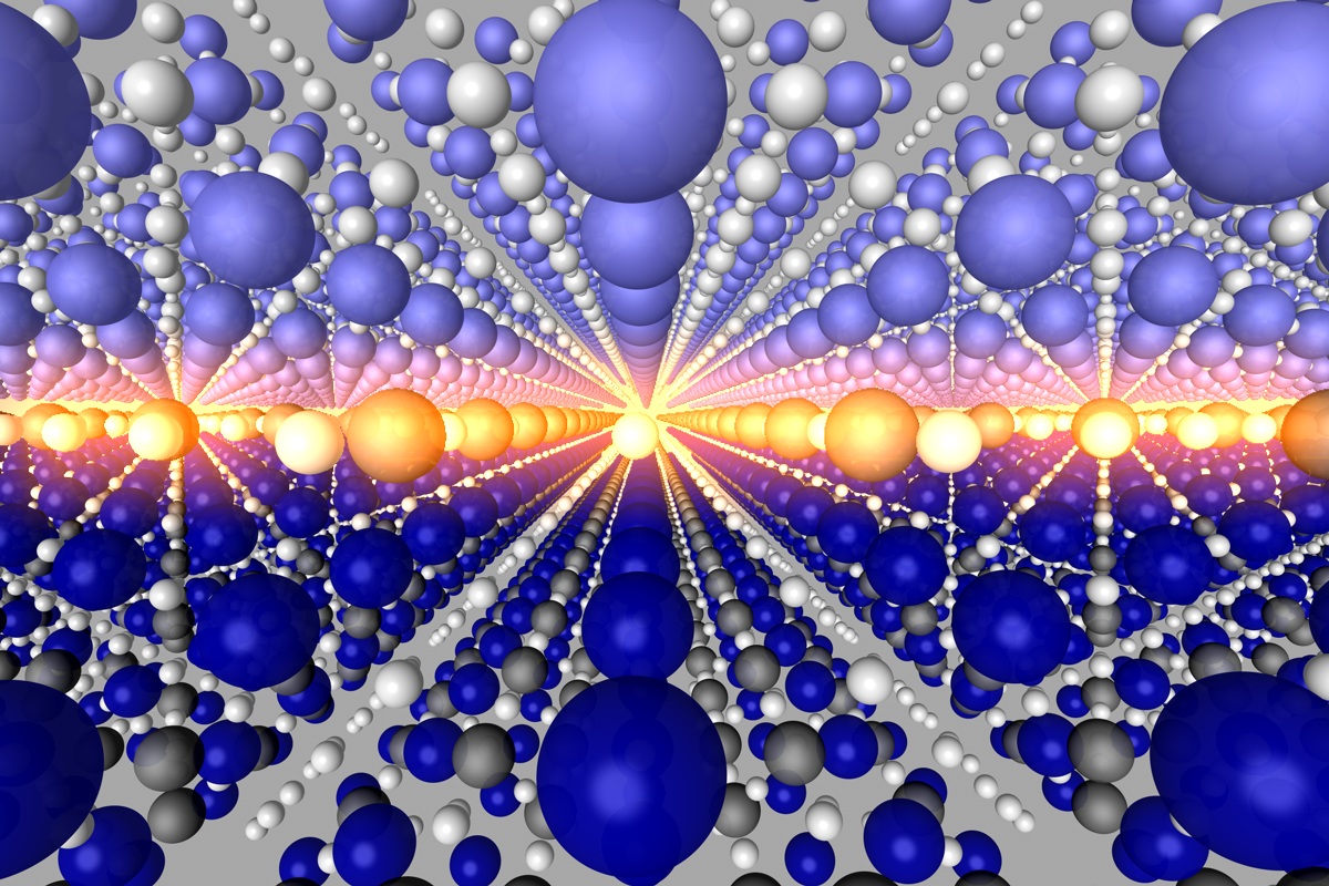
Finally a better example: the figure shows the interface between two materials on the atomic scale. The “balls” depict atoms but are sufficiently abstract to illustrate nothing other than the point being made – the crystal structure as well as the arrangement of atoms at the interface. (c) J. Mannhart, A. Herrnberger
To scientists, these criticisms are probably nothing new. Often, such graphics are produced not to make into actual scientific publications, but as ‘sexy’ cover art or for news stories. However, I do notice a disturbing trend of wrong graphics making their way into a paper. Just look at the table of content illustrations that some journals have. I have seen examples where the majority of illustrations in a paper were based on such science fiction and not on hard, solid data. In some cases, such graphics were even used to underline a scientific argumentation in a paper, to make a scientific point. It can’t get much more wrong than that.
My plea is to scale back the arms war in scientific illustrations. It is of course great to be able to make a device look appealing. But do atoms have to reflect light mirror-like? Why these attempts to be superrealistic when in fact the outcome is the opposite? Illustrations can still be visually attractive even if they are scientifically more accurate, for example by being more abstract. Abstract graphics can look cool, too. Illustrators should keep it simple and stick to the main purpose of the illustration. That way science wins.
Update: In the initial version of the blog post as published today I used the words ‘wrong’ and ‘misleading’ at various instances of the text. To avoid misunderstandings I have now changed it all to ‘wrong’, because it was not my intention at all to create the impression that such graphics are created (or used) with bad intentions.


February 13, 2012 at 12:29
Great post, Joerg. Fully agree. See a good biological example I wrote about long ago:
http://www.columbia.edu/~jp2766/Homepage/Blog/Entries/2007/1/28_Daily_routine_in_the_cell.html
(The last paragraph of the post is the most relevant.)
February 13, 2012 at 21:59
Dear Joerg
As the chief editor of Nature Nanotechnology, the journal that used the image at the top of this page on the cover of its March 2011 issue, I have to disagree with you.
The schematic above shows the overall structure of the devices studied in this paper, and also structure of the MoS2 layer at the heart of the device. It does not depict every detail of the device or the physics, but it certainly does not mislead.
Science is full of approximations and simplifications that are made to enable progress and understanding. Artist’s impressions and schematics work in a similar way.
Peter
February 13, 2012 at 23:05
Dear Peter
Thanks for the comment! First of all, I should clarify that when writing ‘misleading’ I did not meant to imply that such images created in bad faith. Not at all. That’s why I now changed the language above. My apologies if this offended you.
Still, I think that in many such images the science is depicted wrong, for reasons explained above – and as I also write, often such schematics could be better if more abstract/simplistic – so perhaps we might be in agreement here.
Last but not least, as I also explained, my intention is not to point fingers at anyone, far from it. The intention was to raise the issue for debate. As I mentioned, I’ve used such images on my blog, too. And if you look for another example where I have used such graphics myself, here is a cover image based on a paper that I published as handling editor. Some of the criticism mentioned applies as well, in particular given that this is a photonic nanostructure:
http://www.nature.com/nmat/journal/v8/n9/
Joerg
February 14, 2012 at 14:02
Read your post & comments, and I fell like I need to express my opinion on the matter.
I agree that the ‘misleading’ illustrations are becoming ever more popular, but this trend is largely due to some journals and magazines that somehow seem to attract these fancy graphics.
But, I see nothing wrong as well to use an artistic impression of the work. It should just not be side-by-side to ‘real’ scientific work, which could potentially make it misleading. Especially if the journal covers a broader audience.
The only way I see to solve this issue, is for the journals to label these illustrations with something like: “Disclaimer: This artistic illustration does not express the real scientific content of this paper”. (or something similar).
Antonio
February 15, 2012 at 20:43
I also disagree for a number of reasons, for one all the points you mention are quite obvious to anyone working in the field.
But even more importantly the purpose of such illustrations is to convey a general idea of the device and perhaps provide eye candy for the cover, they are not meant to be precise reproductions. Including all the things you mentioned would make them completely unintelligible even if it were possible.
But it’s not possible – you cannot for example realistically depict single photons – EM fields are only a misleading approximation in this case and photon wavefuction is undefined in position space.
So simplifications are not only desirable but unavoidable.
February 15, 2012 at 21:14
Hi Nex
yes, I totally agree that simplifications are unavoidable. As I write in the conclusion of my blog, they would even be better. Why would you draw reflections for metal surfaces even that’s not what it would like? It is these kind of ‘superrealistic’ depictions that I think are wrong. I also think that this would make them easier to understand. The danger is that sometimes trying to be too realistic creates a dangerous illusion of an understanding that’s actually not there if the depiction is wrong (especially to non-experts. Experts should know this for most cases). So better to be more abstract than that, that’s what I mean. And in my view that doesn’t mean that it has to look bad…
Take your example of single photons – they of course have a probability that can be drawn. Or – just make it more abstract, and that would solve the problem, too, I think.
cheers
Joerg
February 16, 2012 at 03:58
I have to agree with most of the arguments of Jeorg in highlighting the “superrealistic” depictions of physical devices, which, despite the best intentions in conveying some idea, could in fact be misleading. The example shown on the top (with the two metallic pins) actually looks like a macro-scale mock-up that could be displayed at an expo booth…